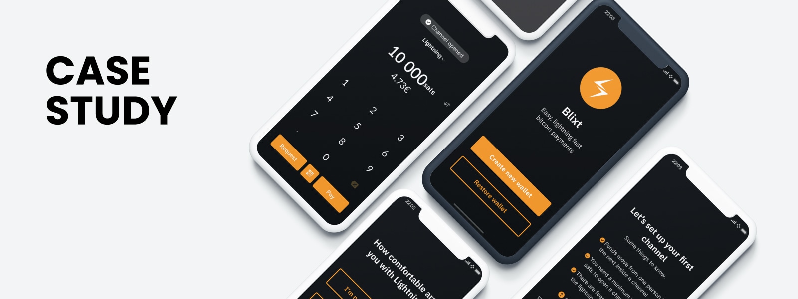
Blixt wallet
How do we help users new to lightning start using their wallet? #
The Bitcoin Design Community ran a design sprint on an open-source lightning wallet. During this sprint, we collaboratively focused on re-designing one aspect of the user flow, the onboarding journey. In this collaborative effort, we got together as a group of designers and researchers, and aimed to improve the user experience using good design principles, and incorporating as much feedback from users as possible.
Blixt Wallet is a non-custodial, open-source, bitcoin and lightning wallet for Android and iOS. It aims to serve users who are familiar with bitcoin, but new to lightning and want to try it out for the first time.
The current user base of Blixt tends to be more advanced and Blixt would like to move towards catering to beginners.
What does Blixt do?
- Onboard someone quickly over lightning so they can have a channel already provisioned to receive funds
- Automatically open channels anytime the user has on-chain funds - Auto pilot
- Automatic channel creation (using Dunder LSP) during initial deposit of funds
- Support for custom LSP
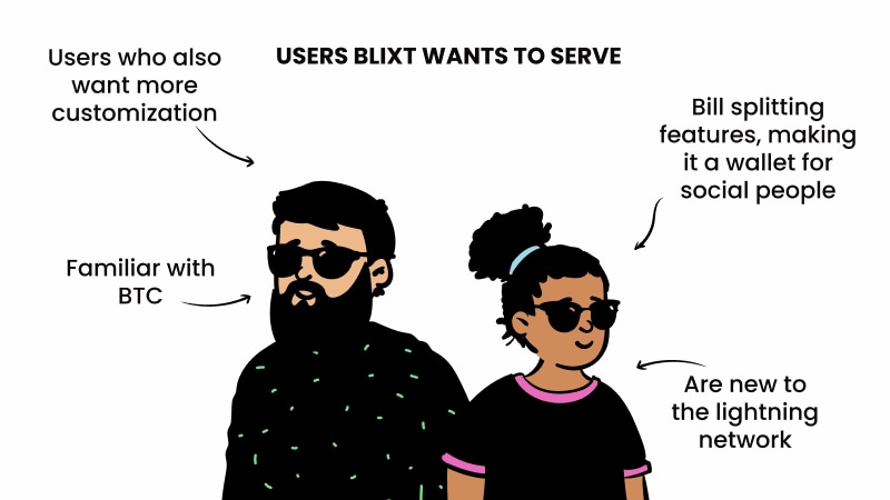
Illustrations: OpenPeeps by Pablo Stanley
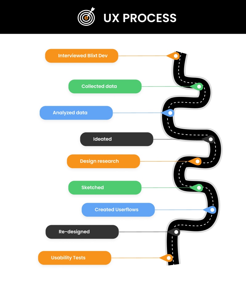
Since Blixt is an open source wallet, we collected user feedback simply by going on their Telegram channel and collecting user comments and questions.
We discovered that Blixt users were struggling to open lightning channels #
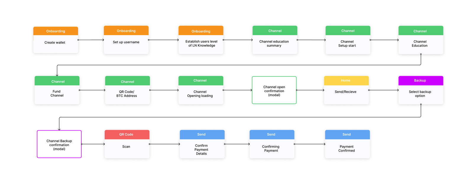
We created a lot of different user flows to find a solution for the best method to open a channel for a user new to lightning, and eventually settled on this one. We decided on this user flow as it educates users first and then takes them to setting up the channel itself.
One of the biggest challenges we faced was: #
Explaining the concept of channel opening to people who are new to lightning. The concept of opening a channel to make a transaction is totally new to them. Next, some users might not be native English speakers, so using words and terms that communicate clearly to a larger group of people was essential.
Usability tests #
After re-designing the interface, we tested the new design by doing usability tests. Here’s the process we followed:
- Plan: We set out clear goals of what we wanted to understand and learn by conducting the tests. We also decided at this stage who we wanted to interview, as well as who we did not want to interview.
- User scenario: We then went on to create a realistic user journey which the tester would walk through, with a clear goal that they would achieve in the end.
- Prototype: The re-designed screenstates were then used to create a clickable prototype to test out the user journey we had in mind.
- Test script: We then created a pre-screening questionnaire as well as a test script which we would use during the testing process.
- Testing: The prototype was then tested on 4 people. During the usability test, they clicked through the prototype and we observed how they interacted with it.
After watching the users testing the wallet we made some observations. Those observations were then grouped into different parts of the user flow. All of the data from the tests can be found here. (We have not included the names of the testers to protect their privacy).
Here’s what we learned #
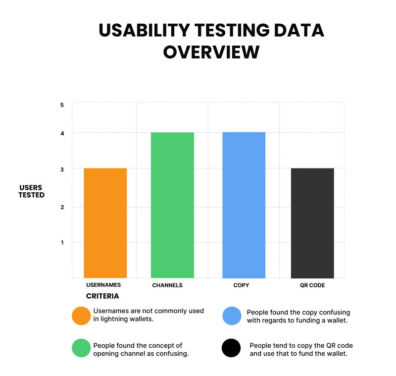
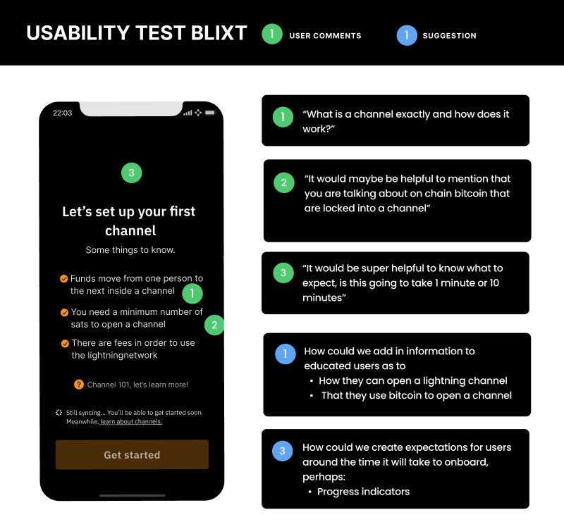
- Users new to lightning are missing a crucial step: the why. They often lack understanding on why they need to open a channel before being presented with a screen to open one. Once this is clear, it becomes easy for a user to understand that this step is necessary before transacting. For more information on channels, see the Technology Primer and Lightning Liquidity section.
- Explaining to users how long it takes to open a channel sets a clear expectation around the process. This would be best done early on during the onboarding journey.
Opening channels is a process unique to lightning wallets and an essential first step during the onboarding process. For users brand-new to lightning, opening a channel in itself is something that is new and unique to them. It is then helpful to explain to users why this is necessary, before making them go through this process. An example of the text could read:
Explaining the concept of opening a channel to a user that has never used a lightning wallet #
“First things first, to use your lightning wallet, you’ll need to set up a channel. Think of a channel as your electricity connection to the lightning network. By opening a channel you are able to make transactions.
To open a channel first we will need to add some bitcoin to it. Once that is done you will be ready to make your first transaction.”
Here’s what we learned about educating users #
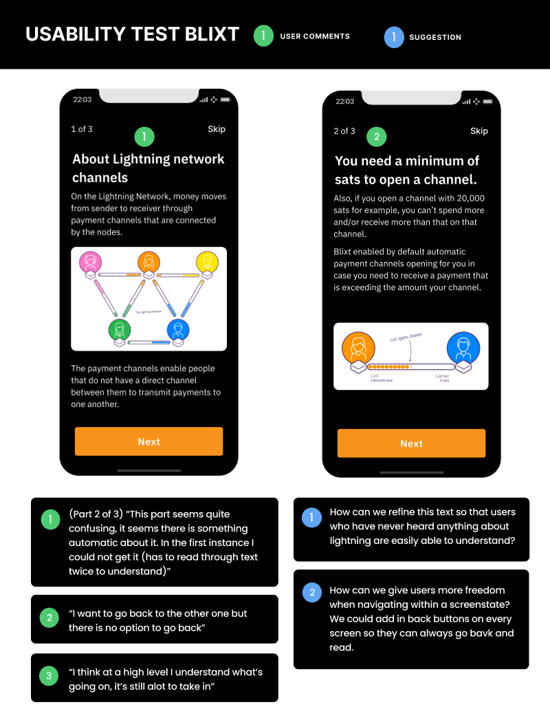
- Providing users with educational screen states is a good idea. It’s always nice to keep the text as short as possible, and the explanation easy. Through the usability testing, we learned that we could further simplify the text in this educational part.
- We also learned that when providing educational screen states, we should allow users the option of going back, so that they can read the text from the previous screen.
In the end #
We had a grand time re-designing this wallet interface. We learned a lot about the mechanics behind running a design sprint. Thanks to Hampus, the developer at Blixt for his input during the redesign. A big thank you to everyone from the Bitcoin Design Community who put in their time, effort and knowledge during this process. The joy of open source is that we get to join forces and do good work together, completely out in the open. If you’d like to get involved in Blixt, feel free to check out their Github or join their Telegram group.
Resources #
- Remote design sprint
- Interview with core developer
- Transcript of Interview
- Project Overview document
- Affinity diagram
Next, view the The Payjoin Experience case study that analyzes and explores the state of and possibilities for Payjoin.