Accessibility
Accessibility is an aspect of inclusive design and covers creating products that enable people of all backgrounds and abilities to use them effectively. With financial inclusion being an important value in the bitcoin ethos, we also need to extend this into bitcoin products being more inclusive for all people, including people with disabilities. Disabilities are not limited to permanent disabilities. We also have temporary situations (situational disabilities) where accessibility is applicable. For example, a woman carrying a baby can only use one hand on her mobile phone. Socio-economic restrictions like poor bandwidth also fall under accessibility. When done well, an accessible product can be used by all users, regardless of any impairment they may have. Can all users have the same user experience and fully enjoy your product?
“One billion people, or 15% of the world’s population, experience some form of disability.”
Via the World Health Organization
Why is it important? #
As a payment network, bitcoin was designed to be borderless and permissionless. But if the applications people use to interact with the network are not versatile enough to accommodate diverse needs, then many of us will still not be able to take advantage of the benefits bitcoin provides. Products should be able to be used and accessed by all people, regardless of their social status, and so this should also extend into people with disabilities. Developing nations are the ones who seek to benefit the most from bitcoin. We want to improve usability for all people so they can easily navigate and move with ease through the applications. This means designing products that use plain language, support users with complex tasks, respect user preferences, work well with assistive technologies, and more.
A great side-effect is that a product designed with accessibility in mind is also easier to use for the part of the audience without impairments. This is referred to as the “curb-cut” effect. For example, many hearing people use closed captioning.
As a wider community, we also have a moral obligation to make products inclusive for everyone and ensure that their experiences with our products are suitable, regardless of their physical and mental abilities.
Categories of accessibility needs #
Vision #
This includes full or partial blindness, color blindness, and other visual disabilities. Three million people in the US alone have vision impairment, and one million people are blind (source). See how a blind person uses an iPhone.
Physical #
A physical disability can effect a person temporarily or permanently. On a practical level this affects their ability to use a keyboard or mouse. Tapping a screen or holding a phone still to scan a QR code could pose as a challenge. Seventy-five million people across the world need a wheel chair on a daily basis (source). Listen to a quadriplegic talking about accessibility.
Intellectual #
Learning difficulties refer to a lower ability to understand new or complex information. Someone with intellectual difficulties also struggles with learning and applying new skills and can also have difficulty reading or understanding things. Over two hundred million people have some form of intellectual disability (source).
Hearing #
This includes hearing difficulties such as being completely or partly deaf, affecting one or both ears. Any hearing loss below 20 decibels is considered a hearing loss. 400 million people have some form of deafness or hearing loss (source).
Literacy #
Illiteracy is a person’s inability to read, write, or understand a simple statement that is related to their everyday life. There are over 700 million illiterate adults worldwide, and more than half of them are women (source).
Tips and examples #
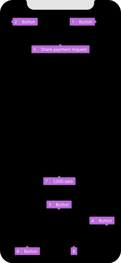
Improving accessibility may seem like an overwhelming task. The most important thing is to get started, so let’s take a look at some basics. Correctly labeling interactive elements is one of the essential practices in accessibility. It allows screen readers to understand and convey the information to impaired users in various ways. The following example illustrates some good and bad practices.
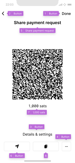
An example of a screen with missing button labels. The small overlays indicate the information provided to a screen reader.
The same screen without UI elements to better highlight what is accessible to a visually impaired person.
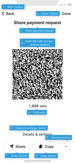
Here, all elements are selectable, well-ordered and labelled. The user has multiple options to share the address, based on their needs.
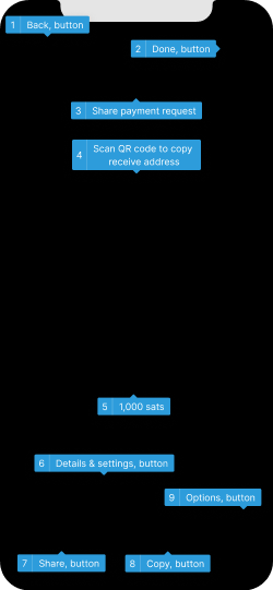
Well annotated content is understandable even when the screen cannot be seen.
It is impossible to know what a button does when it is only labelled as “button”, and not with its function. Testing has shown that QR codes are often not selectable at all, which makes them invisible to users reliant on screen readers. A good solution is a label such as “QR code to copy the receive address”.
Also important is that elements are correctly ordered. Otherwise users reliant on the keyboard, or other linear navigation techniques, will not be able to easily understand what is on the screen.
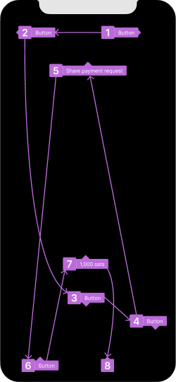
When the order of elements on the screen is not correctly defined, users have a harder time making sense of them.
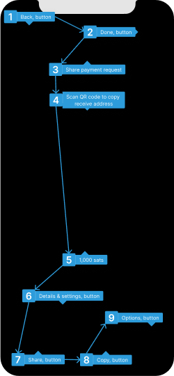
A correct order guides users logically through the UI.
Providing alternate interaction methods and respecting a users accessibility settings are also important. A user with impaired motor skills may not be able to scan a QR code, a color blind user may not recognize red text as an error message, and a blind user benefits from the use of sound or vibration for interactive feedback.
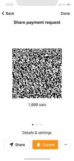
Make sure to offer alternate interaction methods and provide multi-sensory feedback for user actions.
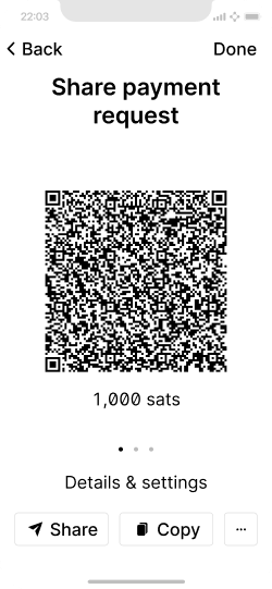
Ensure the layout still works with larger text sizes. Respect other user preferences like reducing motion and increased contrast.
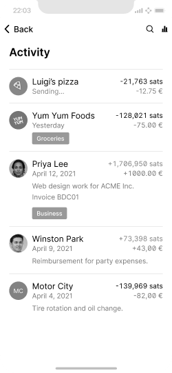
Ensure the information can be understood by those with color vision defficiences. For example, by using “+” and “-“ indicate withdrawals and deposits instead of green and red coloration only.
Accessibility tools #
Operating systems and certain software provide built-in tools to help with accessibility needs, such as screen readers (VoiceOver, Narrator, TalkBack), keyboard navigation, eye-tracking support, and voice control.
The accessibility pages by Apple, Microsoft, and Android provide great overviews of the various needs and features. Many of these work mostly out of the box for applications, but they do rely on elements on screen to be well organized and marked up, so the operating system can interpret and translate them correctly.
Sources of information #
- Bitcoin accessibility guide
- What is accessibility?
- Web accessibility
- Material design accessibility tips
- Web content accessibility guidelines (WCAG) 2.0
- Accessibility guidelines for non-web applications (WCAG2ICT)
- Securing recovery phrases in braille via New mnemonics
Usability testing resources #
- Setup iPhone or iPad for iOS mobile accessibility testing
- Accessibility testing on android devices
- Usability studies for accessibility
- Test your app’s accessibility
Next, we jump into how to design a daily spending wallet.


